
Bicycle Designer Series Goes Baroque.
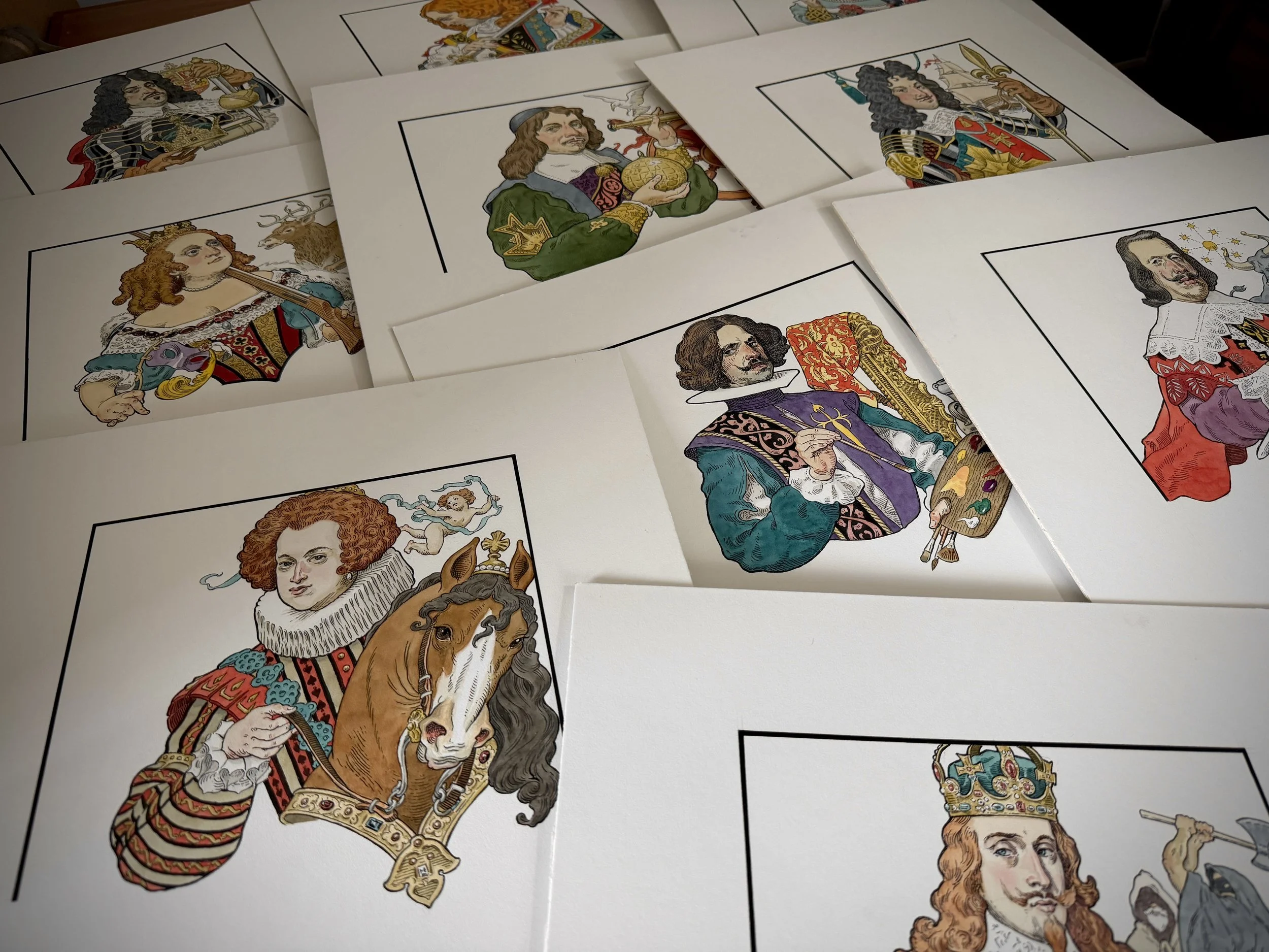
Court card artwork. Ink and watercolor.
The 52 Plus Joker Convention in Niagara Falls, New York, was a remarkable and memorable event, as they always are. It’s an annual gathering of playing card enthusiasts, collectors of antique and modern decks, traders, card producers, and designers. At the 2024 event, I was asked by Tiffany Cousteau from the United States Playing Card Company (USPCC) if I would like to be part of an upcoming “Designers Series Collection” bearing the Bicycle brand. “Go on,” I said as she laid out plans to launch a series of four decks from four different artists. Apparently, it had been under discussion for a while, and with the enthusiastic new leadership of President Craig Townsend, the collection would finally come to fruition.

Tiffany Cousteau
I’ve known Tiffany for a number of years from working on signature playing cards for magician David Blaine, and a 2016 Bicycle deck she commissioned me to create titled “Flying Machines.” I’ve always enjoyed her quick wit, combined with a calm, confident demeanor, as the Industry Channel Manager, which, by the way, bears responsibilities not fitting for the faint of heart. She is constantly juggling multiple projects and initiatives, and traveling as the face of USPCC, yet she generously devotes the time needed to much smaller projects of which I have been a part.
I was on board without question, but particularly so when Tiffany shared the fellow series designers. Brilliant, seasoned creators like Emily Sleights, Elettra Deganello, and Jackson Robinson would be stellar contributors to the four-deck collection. Each of them has devoted followers eager to snatch up their next deck. My biggest concern as I looked squarely into Tiffany’s eyes was the deadline. At that time, I was embroiled in an all-consuming six-illustration project for David Blaine’s television special DO NOT ATTEMPT. As with most television shows, production and editing delays kept me from solidifying my deck concept for longer than I had planned. However, an idea was brewing in the back of my mind. Tiffany assured me that completing the art by mid-September of the following year would make her happy, and so it would go.

Rough sketch of the Rider Back modification.
My simmering plan was to riff on the Bicycle brand Rider Backs design, adapting it to a Baroque theme—one of my favorite art movements. I worked up some rough sketches and shot them over to Tiffany to see if I was staying true to their vision for the series and whether I was proposing any unwelcome brand encroachment. Any apprehensions I had were merited. As it turns out, the Rider Backs are off-limits and cannot be modified in any way, shape, or form. It came as no surprise, since it is an iconic back design and undeniably the most popular and widely recognized playing card. It’s a favorite with magicians, too, because it handles so well and is trusted as authentic and unadulterated. Custom decks can be perceived as trick decks, but that sentiment is changing with time, as signature decks are more frequently being used in the magic world.
With that bubble burst, Tiffany was quick to offer a lifeline. Although the Rider Back design was off the table, the 2012 Maiden Back design was open to interpretation. I’m not sure why, but I thought the Maiden Back was a mature woman, not a tweener of only thirteen years. Similar to the Rider Backs, this more recent standard back reads as timeless. “Okay,” I thought, “This could be just as good, or even better.” My pivot was that the Baroque period was a time when the female form was readily exploited and a part of nearly every artist’s repertoire. With some minor modifications to The Maiden’s carriage and by making her more zaftig, our lovely focal point could meld comfortably into a much earlier era.

Original Maiden Back on the left and the adapted Baroque design on the right.
The first thing I did was strip her of her toga, presenting her as a nude, classical figure, and changed the small corner angles into cherubs, a staple of Baroque compositions. The other design elements were made to scroll and interlock, reflecting the romanticism of the early seventeenth-century aesthetic. I envisioned it like a painted fresco or plaster relief ceiling. It all came together pretty quickly, since I had been pondering the design for months, both while sleeping and as I would wake in the morning – that sweet spot where conscious distractions don’t taint creative thoughts. By the time I put pencil to paper, most of the challenges were behind me.
The next step was running the sketches through USPCC’s legal department, which carefully scrutinizes its brand. All was good with one exception. Nudity is prohibited from the Bicycle brand. Although disappointed, it was not a huge compromise to indicate a sheer covering to comply with company standards. Nudity is a tightrope that can be treacherous.
With the back design composed, I was ready to create the final art. Still working traditionally, I inked it with a quill and brush on scratchboard, using a blade to cross-scratch out areas to simulate an engraving technique. It’s a method that works for me because it’s familiar, efficient, comfortable, and exceptionally adaptable to converting to vector formats for printing. I find my line and brushwork more natural, organic, and fluid outside the digital platform. The minute I pick up a mouse or stylus, I feel stiff, awkward, and stifled. Plus, paper is the medium on which I learned to draw, and there is the appeal of actual, messy, tactile materials.

Various rough sketches exploring costumes and poses for the court card figures.
Still ahead were the card faces, including the courts, ace, numbered cards, and jokers. These, too, were floating thoughts swirling in my head, and how fun it would be to depict actual royal courts from the Baroque art movement. After all, their wealth enabled them to commission extravagant portraits and grand tableaux to glorify their sovereign reigns. Further research would ultimately determine which monarchies should be depicted.
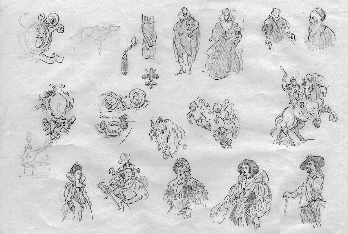
Various rough sketches exploring costumes and poses for the court card figures.
The royal families of England, Scotland, and Ireland, Spain, France, and Denmark in the early seventeenth century became the court card subjects. I realize this focus was all an elaborate excuse to browse through historical portraits and narrative paintings by some of my favorite artists. A deeper dive into the Kings and Queens revealed stories of their accomplishments, interests, and shortcomings, which shaped the card content. Intricate wardrobe details from painted masterpieces guided me, drawing on ornamentation, crown jewels, and the fashion trends indicative of specific regions. The Kings and Queens presented themselves quite naturally. However, deciding on the Jack cards required greater consideration.
Early playing cards didn’t use the Jack character as the third-highest-ranking court card. The Knave was his predecessor. It seemed genuine to resurrect the Knave for this deck that was depicting playing cards nearly one hundred years before the Jack designation became commonplace. I learned that the term "Knave" was unflattering, denoting a man who was untrustworthy and dishonest, although it originally referred to a male servant or a boy. Keeping the historical context in mind, I identified three candidates who could fill the available court positions, including the renowned painter Diego Rodríguez de Silva y Velázquez. This mouthful is more widely known as Velázquez, and someone who was greatly influenced by my first muse, Peter Paul Rubens, the Flemish master who commonly painted for royalty.
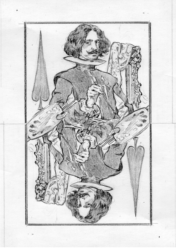
Velázquez

Queen Elisabeth of France

King Philip IV of Spain
Velázquez is the only artist depicted in the deck of cards, keeping in mind that my focus was really about honoring monarchical patronage. The Spanish master artist traveled to Italy to meet Rubens and to see notable works of art he had only heard about or seen in reproductions. The two artists became fast friends, which prompted a second visit, during which Velázquez met a young woman with whom he fathered a child. Oopsie! His new station in life extended his stay in Italy. His absence infuriated King Philip IV back home, who had designated Velázquez his official court artist. Only Velázquez was entrusted to paint the King and Queen’s portraits. Imagine the sacrifice of not having an artist at your beck and call to capture your most precious royal moments, such as your everyday battlefield victories, land acquisitions, or divine callings.
This journey back in time was delightful, and paying homage to an art movement that inspired my own creative path is captured in all fifty-two playing cards and the two court-inspired Joker cards. The elongated suits and Roman numerals on the number cards came to me upon waking one morning. The tuck case is simple in its design, with the word BAROQUE reflecting the Bicycle monacher. And yes, cherubs encircle a spade with touches of embossed gold foil, as it should be. I added a traditional tax stamp seal featuring the royal crown, which would have been expected from any of the four monarchies. Here’s a little tip for collectors who hate breaking seals: A little bestine solvent will dissolve the seal’s adhesive, allowing it to be lifted and reapplied without damaging the tuck case or seal.

Initial sketch for the tuck case lid, face, and side panel.
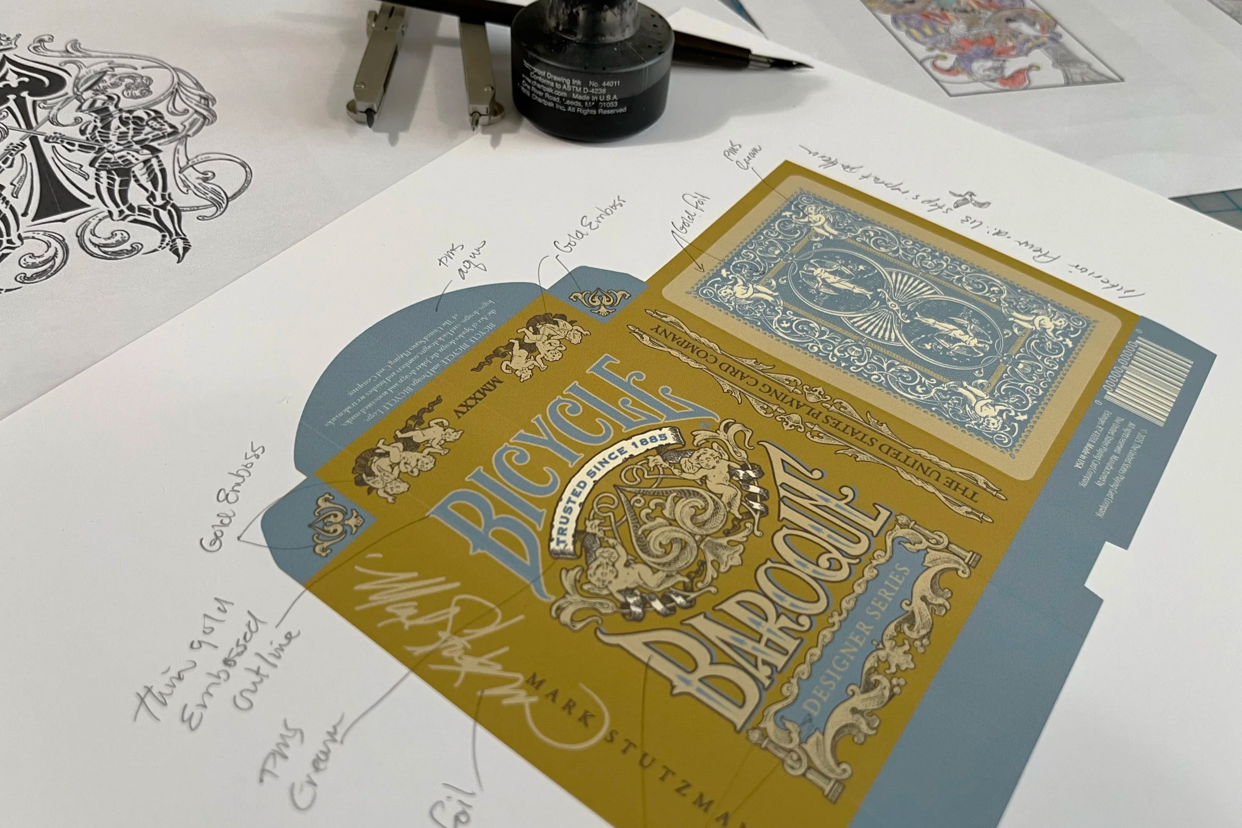
Tuck case mockup with notations for finishes.
Bicycle Baroque is scheduled to be available in mid-December at markstutzman.cards, just in time for holiday indulgences and gift giving. It caters to card collectors, card handlers, history buffs, and lovers of all things Baroque. The royals of long ago wouldn’t fault you for splurging a little.